15 July 2022
The PYTUFLOW package is a Python tool for extracting TUFLOW time series results for use in checking model health, producing calibration plots and plotting results during the simulation. This article will go through a use-case of PYTUFLOW to generate a calibration plot using the Plotly graphing library.
Other plotting libraries are available, such as matplotlib, which can also be used for the plotting TUFLOW results but Plotly provides interactive plots which can provide ready-to-present visualisations that can be easily input into any report. The documentation for Plotly is also very impressive and there’s future application within the Dash dashboard library.
The script also uses pandas which is a common python library for analysing data within python.
If you’re new to Python, you may want to consider reviewing the free Introduction to Python for TUFLOW eLearning course here., it's highly recommended.
Install the Python Libraries
Assuming that you have python installed, then the first step is to install both pyTUFLOW, pandas and Plotly. The various websites linked above have installation instructions but as all are on PyPi both can be installed using:-
python -m pip install pytuflow
python -m pip install plotly
python -m pip install pandas
With the libraries installed we can now start to write the script.
Importing the libraries
Create a text file called Plot_TUFLOW_Results with the .py extension.
The first step is to import the various libraries. We will import the following libraries:-
import datetime
import pytuflow
import plotly.graph_objects as go
from plotly.subplots import make_subplots
import pandas as pd
from pandas import DataFrame
Read in Observed Data
We have observed data from a flow gauge and a rain gauge within our catchment which we will import and plot to compare our TUFLOW results to. The data is stored in csv files which contain a column called ‘TIMESTAMP’ which contains the datetime and a column with the Flow/Rainfall data in with the column names ‘BODMIN DUNMERE’ and ‘BODMIN CALLYWITH’ respectively. We will import both datasets into separate dataframes, one called df and the other df_rf using the pandas pd.to_datetime function. In both instances we also need to convert the format of the datetime data in the ‘TIMESTAMP’ column from a string to a datetime object so that it can be used for plotting the time series.
# Read in data from csv files
df = pd.read_csv(r'C:\Temp\Flow_All.csv')
# Converts the date time string to datetime
df['TIMESTAMP'] = pd.to_datetime(df['TIMESTAMP'], dayfirst=True)

# Read in data from csv files
df_rf = pd.read_csv(r'C:\Temp\Rainfall_All.csv')
# Convert the date time string to datetime
df_rf['TIMESTAMP'] = pd.to_datetime(df_rf['TIMESTAMP'], dayfirst=True)
Set up the initial plot
We will create the starting point of the plot using the Plotly make_subplots function. We will set the ‘secondary_y’ argument to True to enable us to plot both flow and rainfall on the same plot.
# Setup initial figure
fig = make_subplots(specs=[[{"secondary_y": True}]])
The next step is to add our traces to the figure. For the flow data we will add as a scatter plot using the go.Scatter function and set the X and Y to the ‘TIMESTAMP’ and ‘BODMIN_DUNMERE’ columns in our pandas dataframe respectively. We can set the name, the marker colour and set the mode to ‘lines’ which will join our X,Y points.
# Add Observed flow to plot
fig.add_trace(go.Scatter(x=df['TIMESTAMP'], y=df['BODMIN DUNMERE'], name='Bodmin Dunmere', marker_color="black", mode='lines'))
For the rainfall data we will use a bar chart using the go>bar function and display on a secondary y-axis. We will also define the marker colour using RGB values and set an opacity to the bars.
# Add Observed rainfall to plot
fig.add_trace(go.Bar(x=df_rf['TIMESTAMP'], y=df_rf['BODMIN CALLYWITH'], name='Rainfall', marker_color='rgb(26, 118, 255)',
opacity=0.8), secondary_y=True)
We could at this point add the following line and run the script to generate our plot.
# Show Graph
fig.show()
Plotly displays the graph in your default web browser providing the interactive capability to pan, zoom in/out, query values and download the image. A version of the graph created is shown below. It's possible to interact with the graph to zoom in and out, pan around the graph, as well as download a copy.
Currently the rainfall doesn’t show up too well with the theme we have currently, we will change this later.
Read in and Plot TUFLOW Results
We’ll now read in a plot our TUFLOW results using the methods within PyTUFLOW. Firstly we’ll create a list of our TUFLOW results files. For this script, this isn’t strictly necessary but allows us to read in multiple sets of results if we wanted. This is done by initialising a list called FNAMES and then appending the location of our TUFLOW Plot Control (TPC) file for our required results. If we wanted to plot multiple results we just append more tpc files to our list. These and other lines should be added above the fig.show() line.
# Load in TUFLOW Simulation TPC result files into a list
FNAMES = []
FNAMES.append(r'C:\Temp\Model_Results.tpc')
One thing to note, is that our TUFLOW results have a model output which is in hours from the simulation start time. If we plotted this against the datetime within our observed data it would show up in the wrong place. Therefore, we define a variable with our model start datetime in it to which we can add the hours to and ensure our data shows up in the correct location.
# Define model Start Time and Plot Start/End Time
start_date = data.datetime(2020, 2, 12, 12, 0, 0, 0)  # Change this to start datetime of the model time zero
We’ll also define two other variables which define the start and end time for our plot.
plt_start_date = datetime.datetime(2020, 2, 12, 12, 0, 0)
plt_end_date = datetime.datetime(2020, 2, 17, 12, 0, 0)
Next, we can start to load in the results. Firstly, we initialise the ResData() class an empty object.
res = pytuflow.ResData()
The next step is to define our own python function, called graph_po_line, which loads our tpc file, looks for a specified TUFLOW PO line ID and plots the data on our existing graph. Our graph_po_line function is defined with two arguments (the tpc name, which we’ll take from our FNAMES list and the po_ID which will be user defined.
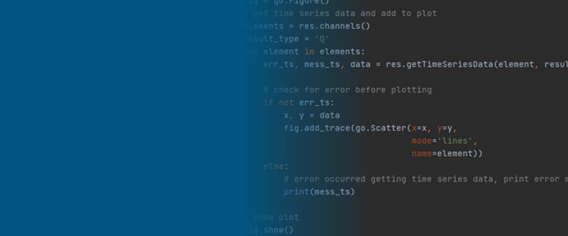
def graph_po_line(tpc, po_id):
We then load in the results and assess whether there are any error messages from our tpc file using the res.load function. If there are no error messages, then the results are read from the tpc file using the getTimeSeriesData method which returns the given element, in this case a 2D PO line for the user defined po_ID identifier and for a given result type, in this case ‘Q’. This returns any errors, any messages and data as a tuple of X and y data points. There is then another check for any errors.
err, message = res.load(tpc)
if not err:
    # get time series results data and add to plot
    po_line = po_id
    result_type = 'Q'
    err, message, data = res.getTimeSeriesData(po_line, result_type, '2D')
If there aren’t any error messages ,then the data is read and we plot our traces to the existing graph. We read the data from the TUFLOW files into x,y variables and then convert to a dataframe, creating a new column with our datetime converted from the TUFLOW model time and the start date. Once converted to a dataframe, then we add the model outputs to our trace using the go.Scatter function.
if not err:
    x, y = data
    df1 = DataFrame(x, columns=['Time'])
    df['datetime_Model'] = start_date + pd.to_timedelta(df1.pop('Time'), unit='h')
    # Converts the TUFLOW model time to datetime
    x1 = df['datetime_Model']
    res_name = res.name()
    fig.add_trace(go.Scatter(x=x1, y=y1,
                             mode='lines',
                             name=f'{res_name} {po_line}'))
Finally, if there are error messages in the loading of the tpc results then these get printed to the python console to enable troubleshooting.
else:
     # error occurred getting time series data, print error message to console
     print(message)
Putting this all together, our graph_po_line function is as follows:
# Function to read and plot TUFLOW PO Q Results
def graph_po_line(tpc, po_id):
    err, message = res.load(tpc)
    if not err:
       # get time series results data and add to plot
       po_line = po_id
       result_type = 'Q'
       err, message, data = res.getTimeSeriesData(po_line,  result_type,  '2D')
       if not err:
          x, y = data
          df1 = DataFrame(x, columns=['Time'])
          df['datetime_Model'] = start_date + pd.to_timedelta(df1.pop('Time'), unit='h')
          # Converts the TUFLOW model time to datetime
          x1 = df['datetime_Model']
          res_name = res.name()
          fig.add_trace(go.Scatter(x=x1,y=y1,
                                   mode='lines',
                                   name=f'{res_name} {po_line}'))
        else:
            # error occurred getting time series data, print error message to console
            print(message)
This function doesn’t actually do anything until we call it. In this case we will call the function for all the items in the list FNAMES. Again, this isn’t necessary in this case but does add an extension to the code to allow for multiple sets of results. For each item in the FNAMES list we will run the graph_po_line function with the TPC specified and for the ‘Dun_Cha_L’ TUFLOW PO line ID. In this example, there is only one TPC in our FNAMES list, so the only one trace is plotted but this could be extended to multiple files, for instance, when comparing calibration plots.
for fnames in FNAMES:
    graph_po_line(fname, 'Dun_cha_L')
At this stage we have now added the TUFLOW results to our graph and can plot the graph by running the script. The resulting graph can be seen below
Cleaning the plot
The plot looks good showing the observed flow, observed rainfall as well as our TUFLOW results but the TUFLOW results are from only a small section of the observed results and we need to zoom in to review the results. The calibration looks pretty good so we can now tidy up our present graph. A lot of these steps could have been undertaken prior to adding the TUFLOW results.
Firstly, we’ll update the ranges used by our X-axis and two y-axes. For the X-axis we will use our plt_start_date and plt_end_date variables from before. For the secondary Y-axis, we will specify the range from 20 to 0 which will set up our rainfall bar chart at the top of our figure making it easier to view.
# Configure Y/X Axis Ranges
fig.update_yaxes(range=(0, 90))
fig.update_xaxes(range=(plt_start_date, plt_end_date))
fig.update_yaxes(range=(20, 0), secondary_y=True)
Next, we’ll add some axis labels.
# Label Axes
fig.update_xaxes(title_text='Date')
fig.update_yaxes(title_text="Flow m<sup>3</sup> s<sup>-1</sup>", secondary_y=False)
fig.update_yaxes(title_text="Rainfall(mm)", secondary_y=True)
We’ll also add a title to the top of the graph and format appropriately.
# Add title and format
fig.update_layout(title={'text': 'PyTUFLOW Example-Calibration,
                         'y': 0.95,
                         'x': 0.5,
                         'xanchor': 'center',
                         'yanchor': 'top',
                         },
                   titlefont=dict(title=24)
We’ll tidy up the legend slightly.
# Add legend and format
fig.update_layout(legend=dict(
                  x=1,
                  y=0.5,
                  bordercolor=0.5,
                  borderwidth=2))
Finally, as a personal preference, as well as allowing the rainfall bar plot to be seen more easily, we’ll set the plot background as white.
fig.update_layout(template="plotly_white")
We now have a finished script which can be run to plot the results and provide the following calibration plot. The final graph can be seen below.
Summary
The finished script and data can be accessed from here.
The script can be modified to plot other result parameters available within TUFLOW PO lines, use other TUFLOW PO and 1D nodes/links as well as being extended to plot multiple TUFLOW simulation results on the one graph. Alternatively, for multiple calibration plots, the script can be modified to show multiple plots on the one page. There’s also a host of configuration options available within Plotly to play within to configure the plot to the individuals liking.
The script can also be used in conjunction with TUFLOW’s Write PO Online == ON command to allow results to plotted on the fly during the model simulation.
Acknowledgements
The observed flow data and rainfall data was obtained from the Environment Agency and is licenced. The underlying model also uses topographic data from Defra. Both contain public sector information licensed under the Open Government Licence v3.0.

TUFLOW - Info
A new version of PyTUFLOW has been released which extends the library's functionality from accessing 1D results to supporting 2D results as well as input side functions. This brings with exciting opportunities to programmatically interact with TUFLOW model build files.
TUFLOW - Info
12d Model and TUFLOW provides an excellent way of integrating what were historically siloed areas of responsibility for civil designers, flood modellers and client liaison. This example showcases how 12d Model - TUFLOW can help customers overcome their problems in design and flooding projects by providing the connectivity from concept through to construction.
TUFLOW - Info
This benchmarking study assesses the performance of TUFLOW 2020 against a dam break test case using data from the Malpasset dam failure in France in 1959. The results show TUFLOW produces an excellent comparison with observed timings and water levels.
TUFLOW - Info
CATCH is a new add-on module for both TUFLOW HPC and TUFLOW FV. It enables constituent (e.g. sediment, nutrients, pollutants, pathogens) generation, transport and intervention / mitigation features in the catchment. It also automates boundary condition information transfer between TUFLOW HPC to TUFLOW FV for fully integrated catchment and 3D receiving water modelling. Click here to learn more.